Sacred Soil speaks to two audiences that want opposite things. Chefs want proof — consistency, provenance, produce that performs on the plate. Direct consumers want meaning. We resolved it by leaning on what they share: both are buying the same refusal of shortcuts.
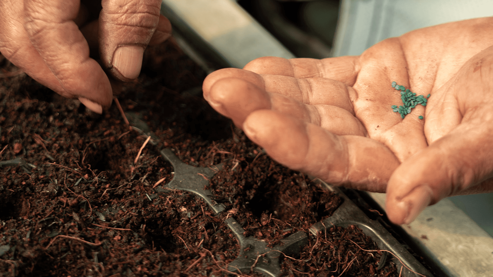
The visual direction demanded discipline. Earthy and restrained — soil, leaf, morning light — without tipping into the folksy register farm brands fall into by default. The identity called for hand-drawn illustration, and we drew it that way. We don't mask. We reveal.


Sacred Soil now looks like what it is — a farm that treats quality as a principle rather than a position. The identity feels made by hand because it was.
For us at Mana Studio, this sat close to something we believe about our own craft. Real is better shared. You don't build a premium brand by hiding the process — you build it by showing it.
Next projects.
(2024-26)